
16 STORIES FOR 16 SWEATERS
FROM APRIL 2020 ISSUE OF WEST END PHOENIX
Charles Molgat – everyone calls him Chuck – is the sartorial MVP of rec hockey, known across the city for his remarkable sweater designs. A former Manitoban, Molgat is also founder of the UUHA hockey league and named his own team the Wheatfield Souldiers, after a Guess Who album. The logo on its sweaters is Burton Cummings’s face. He’s also a devoted sweater collector whose stockpile includes full sets of team gear discovered in every corner: from the Sally Anne to small-town thrift stores to curbside. He’s booked games at the old Maple Leaf Gardens and outfitted full rec teams with Leafs vs. Habs gear – or Jets vs. Habs or Jets vs. Leafs or, it’s true, Jays vs. Leafs. This obsession has helped a lot of players look good, if not play good, and here, he takes us through some of the favourite sweaters he’s made and acquired during a lifetime spent appreciating what we wear when we skate.
Riel Rebellion LEPINE #2
Part of a full team set of concept sweaters I designed commemorating the 1869–’70 Red River Rebellion, this particular sweater features the name of Ambroise-Didyme Lepine, one of the right-hand men of Métis leader Louis Riel, whose visage graces the front crest. Although the back numbers are random, each sweater sports the name of a prominent figure from the rebellion, including several members of the Manitoba Council, a pre-Confederation governing body comprised of French, English and Métis members tasked with negotiating the territory’s transition to a Canadian province. Several ‘players’ will be familiar to Winnipeg residents as local street names, including Marion, Goulet, Spence and Lagimodière. The set made its debut at a 2009 outdoor charity tournament in New York City’s Central Park, which took place over the Presidents’ Day long weekend. In Manitoba, the same holiday is celebrated as Louis Riel Day..

Big Stars EXCLAIM! #13
This sweater is a textbook example of how to create something from nothing. The canvas I used here is a solid black practice jersey that comes to glorious power-pop life with the addition of a couple of feet of custom-cut, gold and white heat transfer film. Fans of good music will recognize the design as a straight-up homage to the massively influential early-’70s Memphis rock unit Big Star; the crest is a rendition of the neon sign that adorns the band’s debut album, #1 Record. The initial inspiration was to come up with a novel all-star jersey for a mixed-squad music league team that could be made quickly and on the cheap. Exclaim! magazine came on board as a sponsor and soon some of Toronto’s finest musician-players were zipping up and down the ice in these beauties, carried by the star, one of the oldest, most common and enduring symbols in sport iconography.

The National #11
As a long-suffering fan of the Winnipeg Jets, it’s been my civic duty to hate the Edmonton Oilers ever since that deplorable squad bumped the Jets out of playoff contention en route to a series of dynastic championship titles. Truth be told, though, I’ve always had an aesthetic crush on the team’s sweaters, particularly the effectiveness of that white piping around the shoulders. This one-off concept jersey I made marries the 1980s greatness of Gretzky and company with the funky digital sobriety of CBC’s The National’s flag the same decade. I rendered this shot-down version of the “exploding pizza” logo in four-colour heat-transfer film and printed it on a twill crest. The back digits recall a couple of occasions when The National was moved to, or rebroadcast, an hour later than its usual time slot, only to return to 10 p.m. like a wandering goalie retreating to their crease.
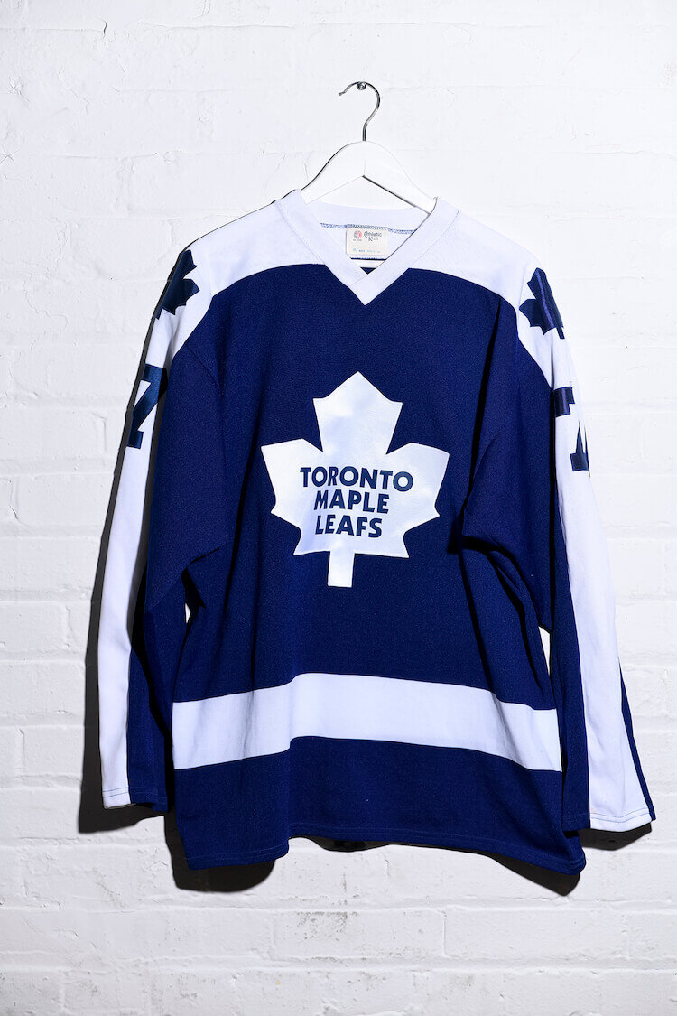
Toronto Maple Leafs McDONALD #7
In 1977 the NHL decreed all teams must have players’ names on their sweaters. At the time, some teams already did; others didn’t. The Toronto Maple Leafs fell into the latter category, and not just because it was considered an unnecessary expense by the notoriously tightfisted team owner, Harold Ballard. Ballard was convinced the edict would have an adverse effect on sales of programs, which audience members purchased to identify the players out on the ice. Warned and then threatened with a hefty fine for noncompliance, Ballard finally acquiesced, sort of. Leafs players’ names were sewn onto the sweaters above the back numbers, but in the same colour fabric as the sweaters themselves. The stunt lasted for two games of an East Coast road swing before Ballard – reportedly dressed down and threatened with a significantly heftier penalty – complied with the new rule.

Austin Ice Bats BROWN #10
A musician friend who used to tour extensively picked up this sweater several years ago at a thrift store in Austin. It embodies at least a couple of major hockey clichés, one being the team’s name. (Put the word “ice” in front of any type of animal and – voila! – you have a team name.) Another being the crest elements: a cartoonish rendering of a creature grasping (if not breaking or biting) a hockey stick. In this case it’s an angry bat. I got to wondering, Why a bat? Is Austin, Texas, known for its bat population? Turns out it is. Specifically the thousands of bats that reside under the Congress Avenue Bridge, which come out in droves every night as the sun retreats beyond the desert horizon. I learned another thing from this sweater, too: Bobby Brown (see Cincinnati Cyclones – Brown #8) spent some time playing for the Ice Bats in the early 2000s, scoring 87 points in 70 games. He wore the number 10 with the team.
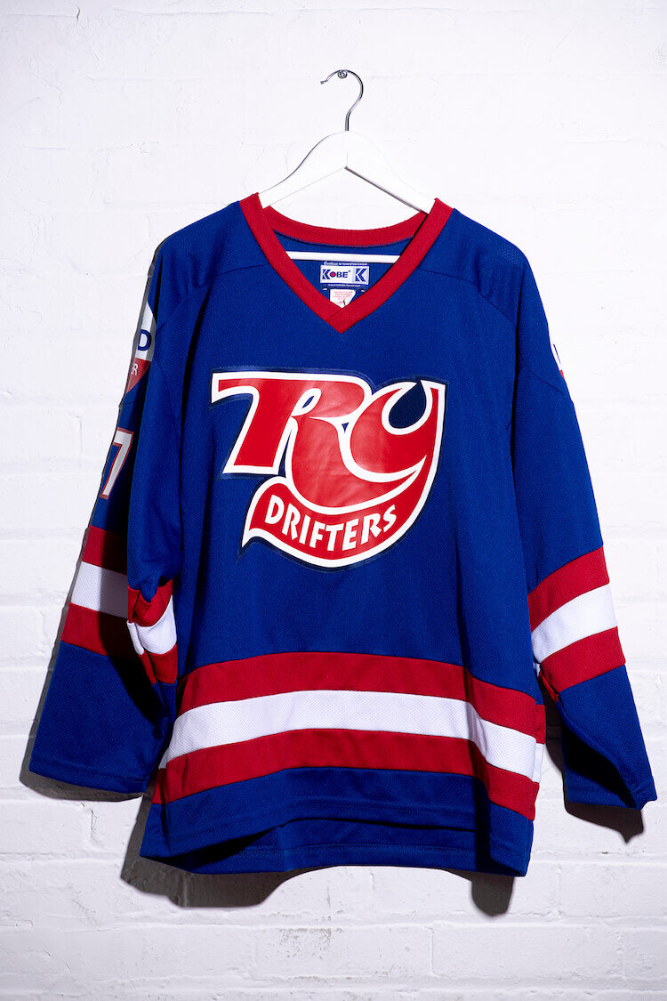
RY Drifters FORD #37
Some say politics has no place in hockey. I say everything is political. This sweater I designed was inspired by the 2013 Globe and Mail investigation by Greg McArthur and Shannon Kari into the history of the Ford family. The RY Drifters was what Doug and his pals called themselves, named after Royal York Plaza in Etobicoke. The crest is a riff on the RC Cola logo, and the Drug Ford shoulder crests are styled after Rob’s mayoral election signs. This design, like the Fords, is polarizing: A friend once wore his to the wrong pick-up game and was aggressively chastised in the dressing room by another player.
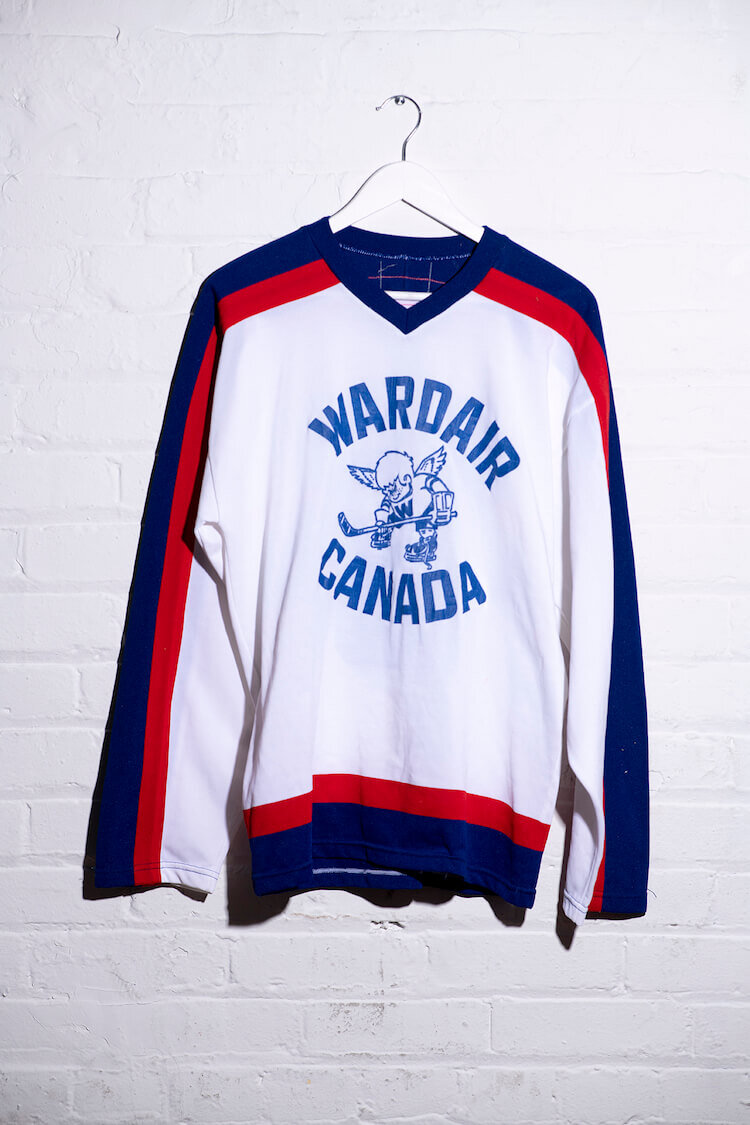
Wardair Canada #19
It’s a pity the average Canadian traveller will never again experience the airborne splendour that was Wardair, whose friendly and generous “Steak & Champagne” service was afforded all passengers regardless of class or status. I found this one in a thrift store in Winnipeg. The airline-sponsored team sweater uses the pattern of the Winnipeg Jets. The crest, however, was borrowed from the WHA’s Minnesota Fighting Saints – albeit sans halo and with a W on the character’s sweater.

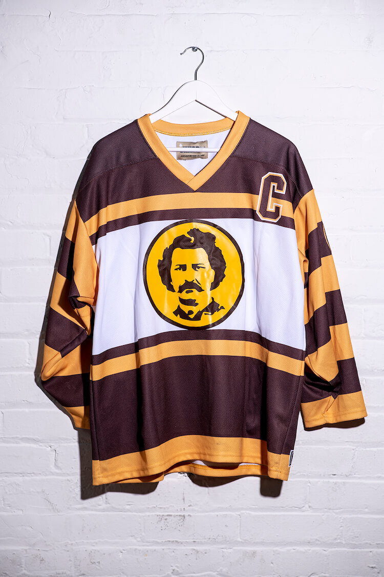
Winnipeg Wheatfield Souldiers MUDGUT #70
The Winnipeg Wheatfield Souldiers rec team was founded in the Manitoba capital in 1999 for the express purpose of travelling to Toronto to compete for the coveted Exclaim! Cup. After five attempts and countless Air Miles, the team finally tasted success in 2003, defeating sworn rivals the Ottawa Songbird Millionaires, to earn the right to drink from the vaunted Canadian arts ’n’ hockey chalice. Since then, the team has relocated to the Ontario capital, where its members (still almost exclusively expatriate ’Peggers) have won eight additional championship titles. This sweater – my own – features a left shoulder patch honouring the Guess Who, whose 1969 LP Wheatfield Soul inspired the team’s name and whose frontman, Burton Cummings, is prominently featured on the crest. The Wheatfield Souldiers remain active to this day, playing primarily out of Upper Canada College and Maple Leaf Gardens in an old-timers’ arts league called the UUHA.

Montreal Expos MOORE #15
The concept here was to create a hockey sweater that emulated a Montreal Expos baseball jersey, including the appearance of a separate, long-sleeved undershirt covering the forearms. This execution required cutting up two sweaters to make it look as if the wearer has donned an oversized baseball jersey instead of a hockey sweater. A range of favourite Expos players was considered for the name and number, including the outrageously outspoken Bill “Spaceman” Lee, super slugger Vladdy Guerrero and multiple Cy Young Award winner Pedro Martinez. In the end I went with the far less likely choice of Balor Moore, and not just because he was the first player drafted by the expansion squad in 1969. Moore’s less-than-stellar career also saw the Texas-born southpaw pitch for the Toronto Blue Jays, as well as the short-lived Triple-A Winnipeg Whips – a singular trifecta worthy of immortalization in air-knit polyester.

Bowie TVC #15
I brought this blank Tampa Bay Lightning-patterned goalie sweater to life with the visage of glam-era David Bowie, staring down the approaching shooter with his baleful, differently coloured eyes. I made this one-off about a year before his passing, which I have yet to come to terms with. It’s impossible for me to look at it without the 1976 Station to Station track “TVC15” playing in my head.
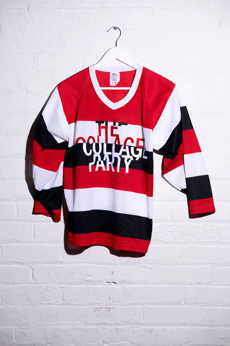
The Collage Party
This is a youth-size prototype I made for the contemporary Toronto-based artist Paul Butler, whose collage parties – which take place across Canada and internationally – have become a bit of a thing. The crest design is his, rendered by me in three-colour tackle twill. He opted for single-colour letters on a solid sweater for the several that were produced. Either way, they required a measure of patient, dexterous sewing.
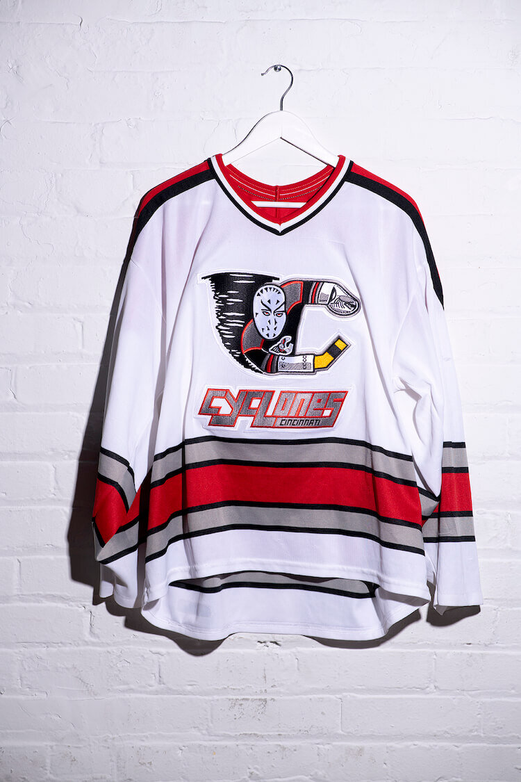
Cincinnati Cyclones BROWN #8
Nowadays, you’re unlikely to see a professional hockey team with a crest as ridiculous as the Cincinnati Cyclones of the early 1990s, and that’s a damned shame. I picked this one up in Kensington Market, along with its red, road-game counterpart. Neither sweater featured a name or number, so I did some research and learned that minor-pro journeyman Bobby Brown (a brother of a former teammate of mine) put in exactly two games on the Cyclones roster around the time of this sweater’s reign. Font- and colour- matched, the two shirts represent half of what I’m confident is the largest collection of Bobby Brown fan jerseys anywhere (outside of Bobby’s attic, perhaps). While the Cyclones remain active in Cincinnati, the team’s uniforms have endured a series of redesigns, including the crest. For a time, the cartoon goalie was moved off the front, reduced in size and affixed as a shoulder crest while a more genuinely cartoonish tornado (based on the team’s mascot, Mr. Twister) took its place. The Cyclones have since adopted a big, stylized “C” as their crest, with an embedded meteorological symbol in its centre – which, in comparison with the original crest, is nothing short of banal.
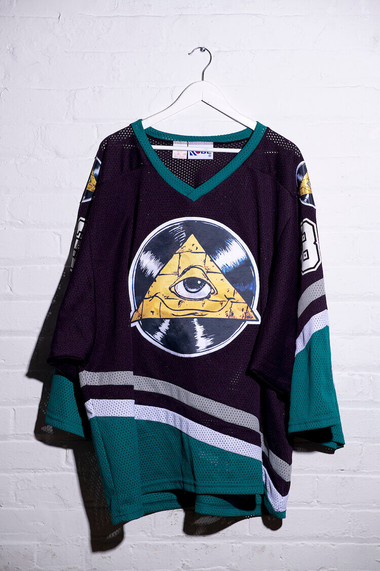
Pyramid Records PYRAMID RECORDS & TAPES #83
My birth certificate says Churchill, Man., but I was actually born at Pyramid Records on the corner of Donald Street and Notre Dame Avenue on the gritty north side of downtown Winnipeg. I emerged, covered in vernix, among bins and bins of used LPs, dusty boxes of yellowed Melody Maker and NME magazines and a towering watercolour of the “Ashes to Ashes” Pierrot (“Daddy?”). It was 1983. This is one of my favourite goalie-cut sweaters, which I designed with three crests featuring the smiling, monocled mascot from the Pyramid Records sign, rendered by the shop’s Stu Reid. The mesh sweater’s pattern is, of course, that of the old Mighty Ducks of Anaheim, the team that the phenomenal Teemu Selanne was dispatched to by Winnipeg Jets owner Barry Shenkarow in exchange for a couple of nobody kids as a price drop for the flagging, lame-duck NHL franchise. The Jets were sold and moved to Phoenix a year later, leaving tens of thousands of fans devastated in a way that music would never leave you.

Joy Division/ Unknown Pleasures FACT10 #1
You’ve probably seen the distinctive cover art of Joy Division’s 1979 album Unknown Pleasures on T-shirts and tote bags. But a hockey sweater? When cut in transfer film, artist Peter Saville’s iconic album cover design is a painstaking nightmare to weed (i.e., remove, with a fine steel pick, all the bits of film that create voids to let the sweater material show through), but the results are rewarding. A head-turner whenever I’ve worn it in the crease, this goalie sweater also features the simple, brilliant Factory Records logo on the shoulders, as well as the Unknown Pleasures catalogue number on the back. If you’ve ever wondered what Saville’s compelling design is all about, it’s a visual depiction of pulsar data related to the death of a star. Joy Division vocalist and lyricist Ian Curtis killed himself 11 months after the album’s release.

Impulse! COLTRANE #21
This is one of a full team set of concept sweaters intended to celebrate the groundbreaking American jazz label Impulse! records. Since the set was to be used for a mixed-squad music-league tournament, the brilliantly simple-but-effective Impulse! logo came to mind and stuck. The backs feature the names of prominent jazz artists whose recordings were among the first hundred releases for the label, along with the catalogue number of their particular release. This one references legendary saxophonist John Coltrane’s eponymous 1962 studio LP. Others include SCOTT #51 (a reference to organist Shirley Scott’s 1963 album For Members Only), ROACH #8 (for drummer Max Roach’s 1961 LP Percussion Bitter Sweet) and NELSON #5 (for Oliver Nelson’s acclaimed ’61 release, The Blues and the Abstract Truth). The set’s goalie sweater? MINGUS, of course.

Black Tuesdays
Created by the wardrobe artists who worked on Guy Maddin’s 2007 film, My Winnipeg, this gem of a sweater, one of the rarest in my collection, is that of the mythic Black Tuesdays. Comprising what Maddin describes in the film’s accompanying book as “an odd assortment of players, in their 70s, 80s, 90s and beyond,” the Black Tuesdays, according to legend, featured the greatest players from Manitoba’s hockey history, who continued to gather and play in the derelict Winnipeg Arena, “despite the first few thumps of the wrecker’s ball.” Maddin gave me the sweater when, at his request, I read from the book at an event in Toronto several years ago. I have cherished it ever since.